Sunday, 13 May 2012

Design Drawings & Inspiration

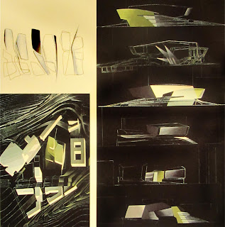
The style and aesthetic of Zaha Hadid's design drawings most resembles the aura of the space I am designing, The Burlesque Studio. It is a space that is dark, mysterious but loud and colourful at the same time. It exudes sensuality and timeless excitement. Zaha Hadid's drawings are dark but gutsy, filled with black but with bold pops of colour. Just like The Burlesque Studio, there is a an elegant and classy touch  but with a powerful punch.


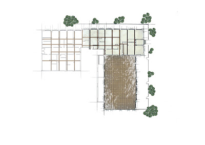
I tried to incorporate a similar drawing aesthetic in my drawings. For now it is fairly simple and quiet, but once the proposal is inserted into the site, the drawings will become more loud and alive. After all, this is a dead space that is activated and brought to life through a radical event.


 Initially I used a dark background with red text, but later on realized that it was almost too literal in expressing my design's aura and feel. So I tried to go for a more vintage look and loosely painted look.


The vintage background and aesthetic almost seemed to distract from the drawings and did not allow the elements to pop, and eventually I decided that a simple white background would best suit my drawings to allow for them to communicate the environment's mood.


Thursday, 26 April 2012

Sense of Taste


This sense was a tough one. At first I kept thinking "how can you taste a space?" "what taste can a space have?" For this sense, I went to a park and a herb garden. Although it was difficult to identify tastes and diagram them, my other senses, such as smell, assisted me in this exercise.


 In the park, I noticed that there was times where it felt and smelt and almost tasted damp or moist, and in other times where it was more dry and dusty. The above diagram shows how the taste of the park differed under the sun or by the shade or in the dark bushes.


The next diagram is about the lake in the park, which added some dimension to sense of taste in the space. It shows how the smell and taste of the space by the lake is different in shade and under sunlight.


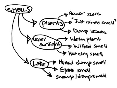
My third diagram is a kind of brainstorm which elaborates further on kinds of tastes and smells within each main area,  by the plants, under sunlight, and  by the lake.


Next, I did a diagram of  my experience as I picked a tree and slowly walked towards and under its leaves and away from it again. What I noticed was that the strength of the floral or fruity flavor grew stronger and stronger as I got closer to the tree, even though there were many flowers on the ground. This is portrayed through the density of the dots in the diagram.


My final diagram is about the different things my pallet could pick up in the herb garden. Some of the flavours and scents were of apples, lemon, oregano and other herbs, while some other smells I couldn't quite identify and so I had associations with other smells they were almost identical to, like  my grandma's pantry.


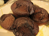
After making the diagrams, I started to make a model about my fourth diagram (density of floral/ fruity smell by trees), and our material for this week was.... cake!


The main cake structure is a representation of the tree, while the circles represent the dots in the diagram. Just as the diagram shows, the circles in the model are more concentrated within, on, and closer to
the tree, which shows the experience of tastes as you approach the tree closer and closer.


Friday, 6 April 2012

Sense of Touch

This week, I explored the sense of touch and how it relates to place making. At first, we were given a few objects which we had to close our eyes and feel different objects and blindly diagram the way the different textures and surfaces felt.
 

My first diagram is about the surface of the bristles of a welcome mat. through different lineweights I've expressed the sharpness and bluntness of some of the bristles.


 The diagram above is about the feeling of tiles; here, i tried to diagram what I felt with my hands.The thing that was most obvious to my hands was the gaps  between the tiles and the inconsistent lines on the smooth tiles.

The next diagram is about the surface of a bundle of straw. As you moved your hand over the straw some bits were curved and smooth, while other parts were spiky, sharp and unpleasant to touch. I tried to convey the two different experiences in the above diagram.


My fourth diagram is about the folding of the coconut tiles and the different depths within its surface  during the overlapping of layers.


Next, I draw a diagram conveying the texture of wire. This wire had threads wrapped around it which created  a pleated texture.


The next diagram is about the floor of the Melbourne Gaol and the different levels. The surface of the floor by the stairs have little round rubber bumps.


The final diagram is once again about the floor of the Melbourne Gaol. This diagram shows the textures of the surfaces near the trees. First off your feet feel a smooth but hard floor, then little pebbled uneven flooring and finally positive and  negative spaces.

This week my model is made of straws. I used white straw to be able to accentuate the shadowing of my model. Through my model, I tried to portray the texture of the welcome mat. I had to show the uneven leveling and the sharpness and bluntness of the bristles.